Data-Driven Meetings: Leveraging Analytics for Productivity and Cost Efficiency
Enhance meeting efficiency with data-driven insights on frequency, cost, and engagement. Optimize practices for productivity and cost savings with...
Optimize meeting productivity with visual analytics for meeting data. Transform raw data into actionable insights, streamline meetings, and enhance engagement using Flowtrace's real-time visual tools.
Visual analytics have become essential for transforming raw data into actionable insights. This is especially valuable in managing meeting productivity, where complex data, such as attendance trends, engagement levels, and costs, can be challenging to interpret without a clear visualization. Visual analytics puts these metrics into accessible charts, graphs, and heatmaps, making it easier for leaders to understand patterns and make informed adjustments quickly. With the right visual tools, organizations can shift from gathering data that gets overlooked to visually assessing metrics and using them to take action, optimizing meetings to enhance productivity, engagement, and focus.
Meeting data includes various metrics that organizations can track to assess the effectiveness, efficiency, and cost implications of their meeting culture. By analyzing these metrics, teams better understand how meetings impact productivity, resources, and employee time.

Collecting and analyzing these meeting data points helps organizations spot inefficiencies and opportunities for improvement. By transforming raw data into actionable insights, leaders can make data-informed decisions, streamlining meetings to foster a culture that values productivity and focused work.
Visual meeting analytics provide a better advantage in transforming complex meeting data into easily understood assets. By using visual tools like charts, graphs, and dashboards, organizations can quickly assess key metrics, such as meeting costs, attendance patterns, and timing, making it easier to drive impactful decisions.
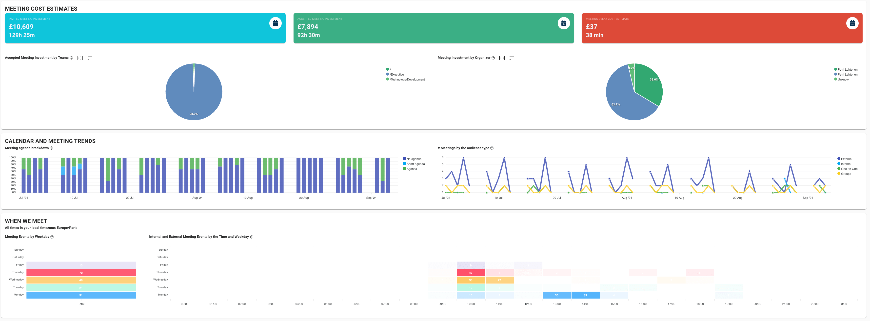
Visual representations simplify complex datasets, making patterns and trends more accessible at a glance. For example, line graphs can reveal patterns in meeting frequency, and heatmaps can identify peak scheduling times, enabling teams to easily assess where inefficiencies may lie.
Data visualization enhances decision-making by allowing leaders to pinpoint specific inefficiencies, such as frequent delays or overstaffed meetings, prompting data-informed adjustments. Visual tools make it easier to compare metrics, like meeting duration versus agenda adherence, highlighting correlations that are valuable for optimizing practices. Visual analytics helps prevent “data blindness,” ensuring critical trends are not overlooked, supporting better, faster strategic decisions.
By presenting data in an accessible visual format, visual analytics promote a culture of transparency and engagement among all stakeholders. This accessibility enables teams across departments to engage with meeting data, encouraging proactive improvements. Accessible visuals facilitate cross-departmental understanding, creating a shared language around productivity metrics and helping all levels of the organization align toward more efficient meeting practices.
Visual analytics enable leaders to gain clearer insights into key meeting metrics, making it easier to spot trends, inefficiencies, and opportunities for improvement. Three essential meeting metrics for visual analysis are meeting cost estimates, timing and attendance trends, and participation levels.
Visualizing meeting costs with bar charts or pie charts provides a transparent view of the cumulative financial impact of meetings across departments or specific roles. This approach enables leaders to see how much time and resources are spent on meetings, highlighting potential areas where costs can be optimized.

For instance, by tracking costs per department, it becomes easier to identify groups where meeting investments are particularly high, suggesting a need to streamline or reprioritize meeting practices. Such visual insights help organizations make informed decisions to maximize their meeting ROI.
Using visual tools like heatmaps and line graphs to analyze timing and attendance trends allows organizations to pinpoint peak meeting hours and identify patterns in punctuality and frequency. Heatmaps can indicate which days or times see the highest concentration of meetings, helping teams schedule around periods that may otherwise disrupt productivity.

Line graphs can track attendance over time, showing whether certain teams or roles are consistently punctual or prone to delays, offering insights into scheduling adjustments or workload management.
Visualizing participation through data on accepted versus invited attendees, as well as tracking the duration breakdown for each meeting, helps gauge engagement levels across teams. By comparing the number of attendees against those who actively participate, organizations can assess whether meetings are effective in keeping attendees engaged or if they may need to refine attendee lists. Duration breakdowns provide a view of how long each part of the meeting takes, allowing leaders to analyze engagement and ensure that discussions are timely and relevant.
Visual analytics allow organizations to monitor meeting data in real-time, uncovering patterns that can inform adjustments to optimize productivity. By tracking key metrics like meeting frequencies, durations, and delay costs, companies can quickly detect areas of overload and identify ways to improve meeting efficiency.


Flowtrace’s visual analytics provide real-time insights into key meeting metrics, empowering organizations to monitor, assess, and adjust meeting practices for optimal productivity. By transforming complex meeting data into accessible visual formats, Flowtrace enables leaders and teams to quickly identify inefficiencies, streamline meetings, and ensure alignment with productivity goals.


Visual analytics bring immense value to meeting management by transforming raw data into actionable insights that are easy to interpret and apply. By simplifying complex metrics, visual tools allow organizations to make well-informed, data-driven adjustments that enhance meeting efficiency and productivity. Flowtrace’s real-time analytics make it possible for leaders to identify inefficiencies, refine meeting practices, and foster a more intentional, balanced meeting culture.
Enhance meeting efficiency with data-driven insights on frequency, cost, and engagement. Optimize practices for productivity and cost savings with...
Optimize meeting effectiveness with data-driven metrics on preparation, cost, participation, timing, and accountability to enhance productivity and...
Transform your organization with data-driven meeting cultures. Learn how to optimize meetings, increase productivity, and drive better business...